
Today we are going to retrieve all the restaurants from the restaurant database and use them to populate a web page. We will use CSS @media along with CSS Grid to create a web page which is 'responsive' i.e. which adapts to the screen size of the user's device.
each Handlebars helper keyword (13 mins)Our app has an array of restaurants that we want to display on our page. Handlebars enables us to iterate over an array of data and repeatedly add the same parsed html block to our final page. This is how dynamic lists of content are rendered. The example below can be seen all over the Internet and is a good example of a card component.
Can you recognise the template vs the dynamic content in the example above?
Our first step is to prepare the data for the view template and the second step is to pass it to the view template. The example below uses sequelize to fetch all the restaurants and passes this to the home.handlebars layout template.
response.render is the matching string name of the layout file we want to render. In this example, the name 'restaurants' refers to a file named home.handlebars.response.render is the Restaurant data returned from the sequelize query.app.get('/', async (req, res) => {
const restaurants = await Restaurant.findAll({
include: [
{
model: Menu, as: 'menus',
include: [{model:MenuItem, as: 'items'}]
}
],
nest: true
})
res.render('home', {restaurants})
})
To use include as in the code above, make sure your Restaurant class has the following aliases added. This config sets the name of the property our associated model will be stored on i.e. restaurants.menus.
Restaurant.hasMany(Menu, {as: 'menus', foreignKey: 'restaurant_id'})
Menu.belongsTo(Restaurant, {foreignKey: 'restaurant_id'})
Also ensure your Menu class has the correct aliases as follows:
Menu.hasMany(MenuItem, {as: 'items', foreignKey: 'menu_id'});
MenuItem.belongsTo(Menu, {foreignKey: 'menu_id'});
You will be able to see the impact of the above in the SQL statements output when running the server.js file.
In our view template there will be an object called 'restaurants' that will be the array of data that came from await Restaurant.findAll(). We can write our html elements as if this was an html file and when we want to parse some dynamic content we can use handlebars to create placeholders. This is very much like 'mail merge' in word or other pieces of software you might have come across.
To repeat a block of code for every item in an array we can use the built in template helper {{#each}} that comes with handlebars. For this lesson, let's just retrieve the restaurant data and display the name and number of menus in each restaurant. In tomorrow's lesson we will look at using nested loops in Handlebars to display the menu and menu items on another page.
<h1>Restaurants</h1>
<section>
    {{#each restaurants}}
        <article>
            <header></header>
            <main>{{this.name}}</main>
            <footer>{{this.menus.length}} menus</footer>
        </article>
    {{/each}}
</section>
From the code above where does the repeating block of html begin and end? Load the page in your browser, when you inspect the html in the Layouts section of Developer Tools, what do you expect to see?
node populateDB.js to load the restaurant json file and insert matching rows into the Restaurant, Menu and MenuItems tables.home.handlebars and include Handlebars code to loop through the array of restaurants and display the restaurant name and number of menus. Don't worry about the Menu or MenuItems at this stage, we will add this in tomorrow.server.js file to perform Restaurant.findAll and pass the resulting data into homeNote: If you get stuck, here is the solution to Lesson 1
style.css file served from your public folderWe have restaurants on the page! What we don't have is something attractive or pleasing. We need to give our html page some loving CSS rules to lay it out nicely. Designing for the web is quite tricky because the screen sizes for a web page on different devices are so dramatically different.
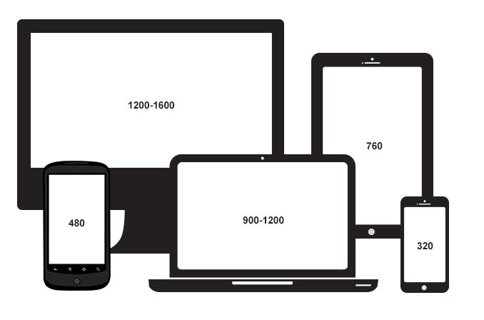
Where do we put things if we want our page to look good on both a mobile phone and a large 26" monitor? The anwser to this question was beautifully addressed by Ethan Marcotte back in 2010 an a blog he wrote called responsive web design.
CSS comes with a @media API which was orignialy added to the spec so you could style a printer friendly version of your page. The basic API of @media enables you to apply css to your page at particular screen sizes. You can find a video which explains @media in more depth under the Additional Resources section of at the start of this web page.
Media queries can be used to check things like:
The CSS is immediately applied so your page does not require a refresh for the new CSS rules to be visible once your screen size changes.
Using the @media API solves the problem of having to serve different html templates and css to different devices.
The viewport is the visible area of a web page.
The viewport varies with the device e.g. the viewport on a mobile phone is smaller than on a computer screen.
To make our page responsive (i.e. to look good on all devices) we need to gives the browser instructions on how to control the page's dimensions and scaling.
Add the following line to the <head> element of your html main.handlebars file.
<meta name="viewport" content="width=device-width, initial-scale=1.0">
The width=device-width part sets the width of the page to follow the screen-width of the device (which will vary depending on the device).
The initial-scale=1.0 part sets the initial zoom level when the page is first loaded by the browser.
The impact of setting the viewport can be visualised here.
The way to implement a responsive layout is start with the smallest screen size; the mobile. These layouts are often the most simple. As the screen size get larger you can start to make more use of the real estate that becomes available.
Lets start. Empty your style.css and add the following css:
* {
    padding: 0;
    margin: 0;
}

/* put css styling for
   mobile devices here */

@media screen and (min-width: 40em) {
  /* put css styling for mid-sized screens here */
}

@media screen and (min-width: 60em) {
  /* put css styling for massive screens here */
}
screen refers to any device with a screen.
Note that we are using em units here rather than pixels. This allows elements to scale if the root element changes (e.g. if a user changes their default font size, all elements on the page will scale appropriately).
This css gives us two break points, one at 40em and the other at 60em. We remove any browser default padding or margin. Can you get your background color to change at the different break points?
CSS Grid Layout presents a layout system with rows and columns.
You can find a video which explains CSS Grid in more depth under the Additional Resources section of at the start of this web page.
Let's consider the different types of devices that we will display our restaurant web app on. Open up Chrome Developer tools and select the 'Device Toobar`.

Select a mobile phone. Set the orientation to portrait. For small screens our content can just be in a single column to allow the user to scroll through the restaurants. We want a single resturant card to occupy the width of the screen. So let's replace our existing styles.css file to have the following:
* {                 /* applies to all elements */
    padding: 0;
    margin: 0;
}

/* css defaults for mobile devices */
h1 {
    padding: 1rem;
    border-bottom: solid 1px black;
}
article {
    border: solid 1px black;   /* adds a border around the box */
    width: calc(100% - 2rem);
    height: 35em;
    margin: 1rem 1rem;
}
Now we have a card shape box in which we can display information about each restaurant (including its 'thumbnail' image). Each box will be spaced out evenly and we can scroll through them. We are using calc() to calculate the width of the viewport minus the margins either side.
Once our viewport size has broken through to be greater than 40em we want to override the previous styles to jump from a single column layout to a 2 column layout. Add the code below to your styles.css file:
@media screen and (min-width: 40em) {
    /* css overrides for mid-sized screens goes here */
      section {
          margin: 1rem;
          display: grid;
          grid-template-columns: auto auto;
          grid-template-rows: none;
          gap: 1rem;
      }
      article {
          margin: 0;
          width: 100%;
      }
  }
We now apply a grid layout to the <section> element. That grid is applied to the section's children elements (all the <article> elements). We don't know how many restaurants we'll have so we are not defining the rows in this case. We also adjust the width of the <article> elements and remove the margins, we pass this responsibility now to the parent 'grid' element. CSS 'grid' has a very handy gap property that will deal with spacing between grid elements. Finally we can use the margin of the <section> to add some spacing all round the items in the grid.
For larger devices, we want to jump to 3 columns. To do this, we just need to override one property by adding the following code to our styles.css file:
@media screen and (min-width: 60em) {
    /* css overrides for large screens goes here */
    section {
        grid-template-columns: auto auto auto;
    }
}
We have now covered responsive layouts using CSS @media (media queries) and taken a quick look at the power of 'grid' in CSS.